Tableau
I am sure you have heard about the Tableau that is why you are here. Tableau is one of the widely used visualization tools which helps in making data-driven decisions. It is compatible with various data sources such as CSV file, Excel, SQL Database etc. The aim of this post is to provide an idea regarding the possible visualizations in the Tableau for the beginners.
Basics charts in Tableau
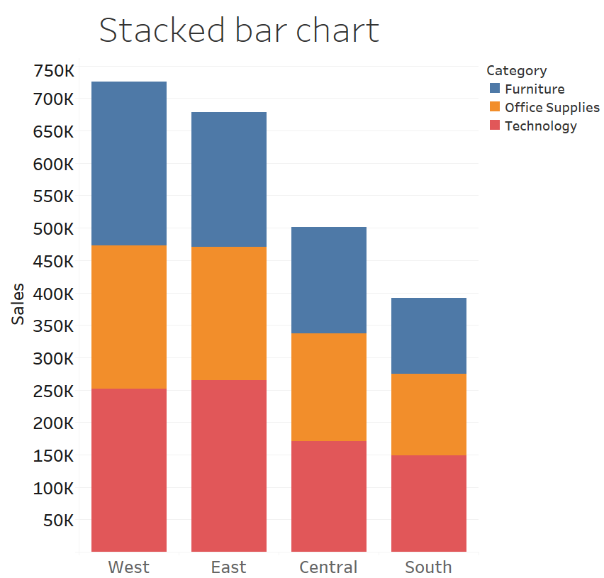
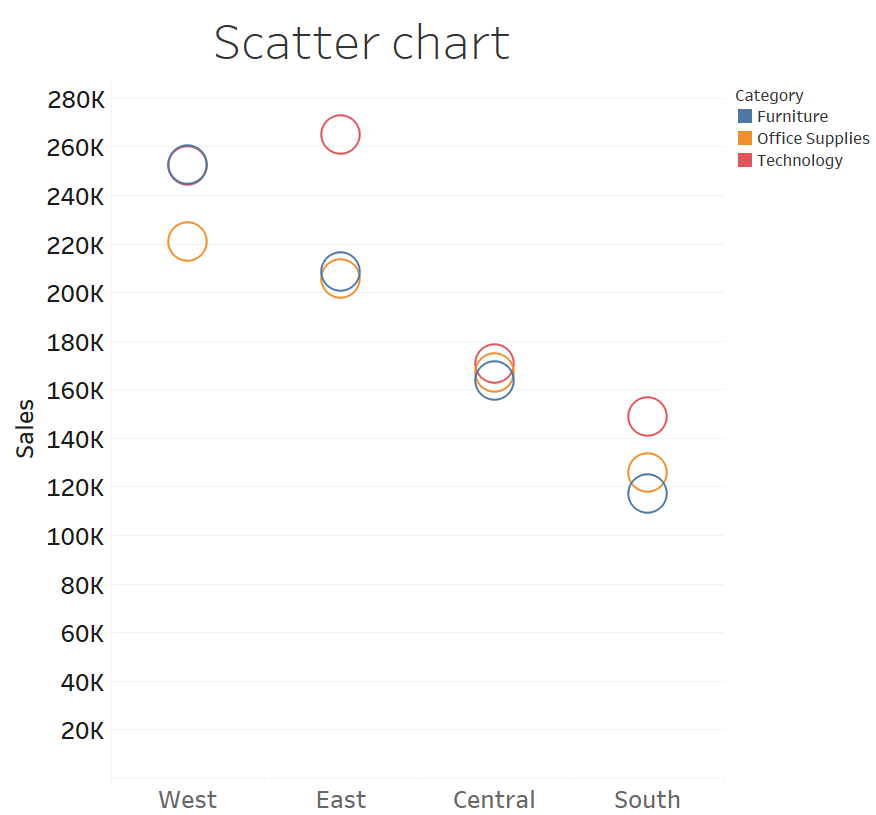
In the following three graphs, the same data is represented in a bar chart, bubble chart and pie chart. Following graphs show the sales of the company in four different regions namely East, West, Central, and South region.
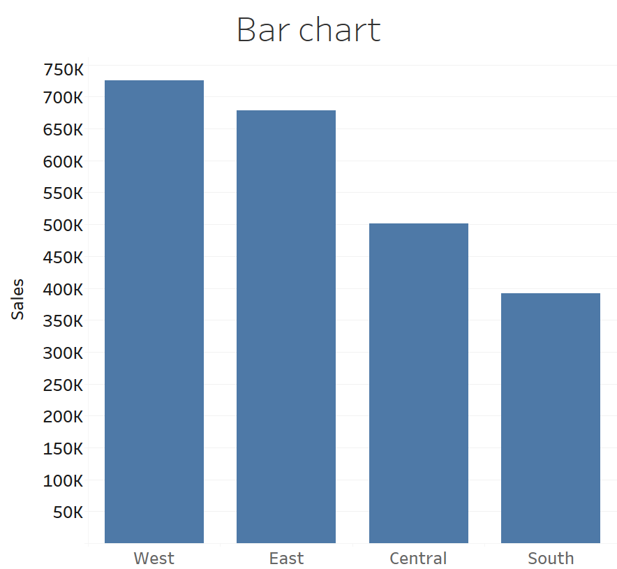
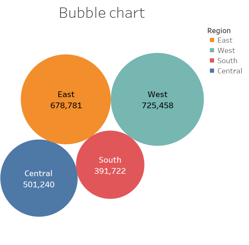
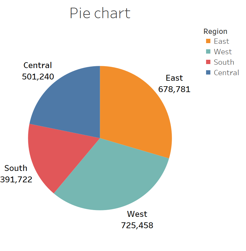
In order to show the region and Sales for each category the data is plotted using stacked bar chart and scatter chart . You can select and visualize the data using these graphs in Tableau with few clicks once you have basic understanding about the charts in Tableau.
Filter to plot the Subset of the data
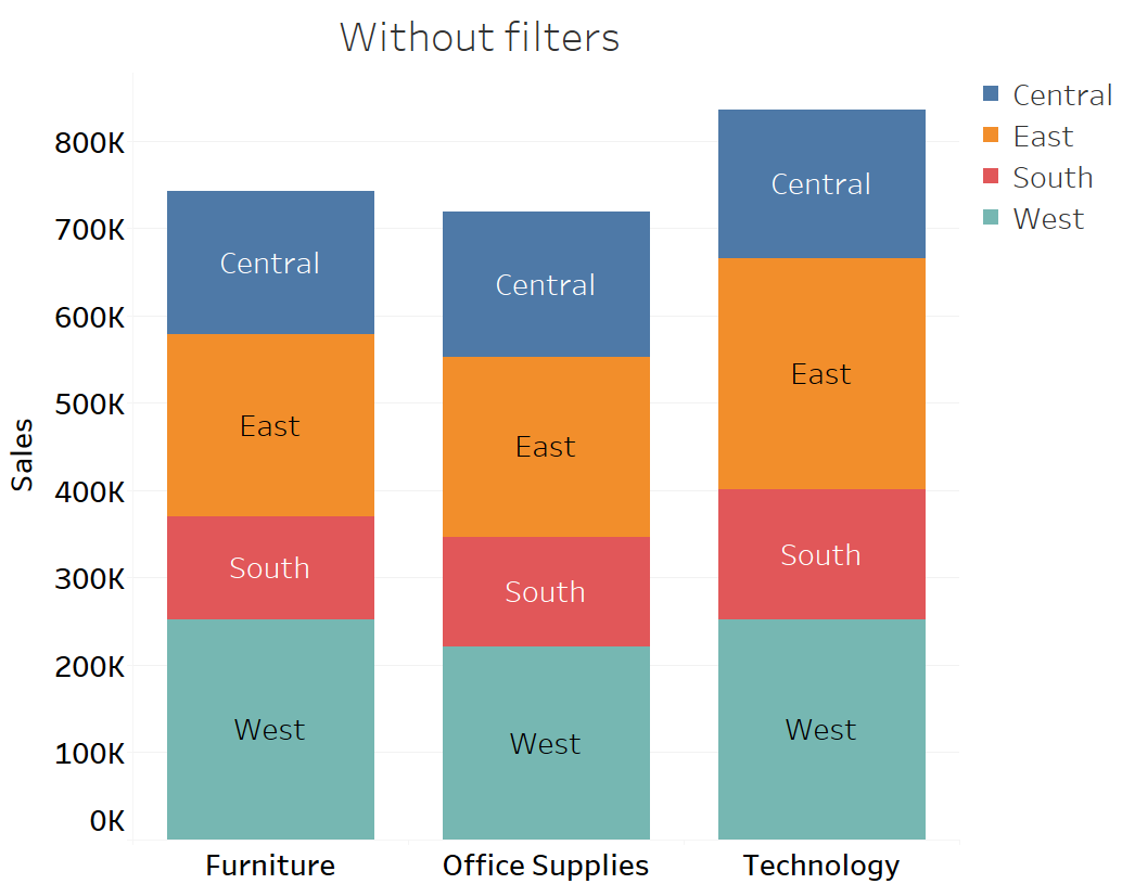
Filters functionality of the Tableau can be used to exclude data in the graph. In the following graphs, the sales for each category is plotted for all four regions (Central, East, South, and West) as a stacked bar chart without filter.
To observe the stacked bar chart for only Central and East region, we can use the filters as shown in the Figure below. In the following graph, region filter is used to exclude South and West region.
.png)
Dual axis
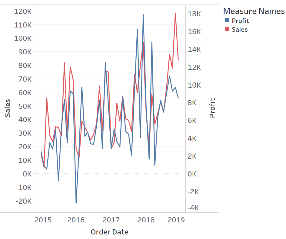
The range of sales and profit is different so primary axis is used to show the value of sales whereas secondary axis is used to show the value of profit. In the following graph, because of the dual axis the scale of sales and profit is different which makes the fluctuation of sales and profit comparable. It can be clearly observed from the diagram that when there is a spike in the sales then profit also has a spike. Hence, correlation of profit and sales are prominent in the dual axis graph.
Histogram
A histogram is a distribution of the continuous numerical data. Bins are created to arrange an equally sized range of numerical data to plot a histogram. As shown in the following figure, data is divided into an Age interval of 10 years. From the histogram, it can be observed that the number of the customers is highest for the Age group of 30 to 40 and lowest for the age group of 0-10 years.
.png)
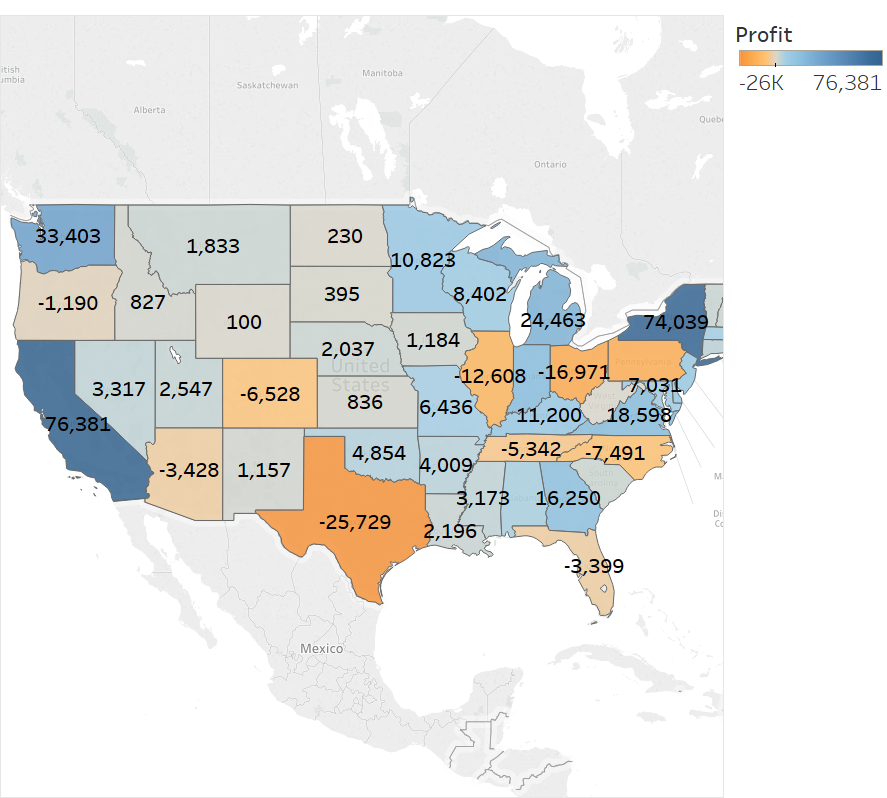
Map
Data with longitude and latitude information are easy to visualized using map. As Tableau package comes with geographic coordinates all over the world, such data can be easily represented in a map. Following map shows the profit in each state of U.S.A and the profit value is also color coded.
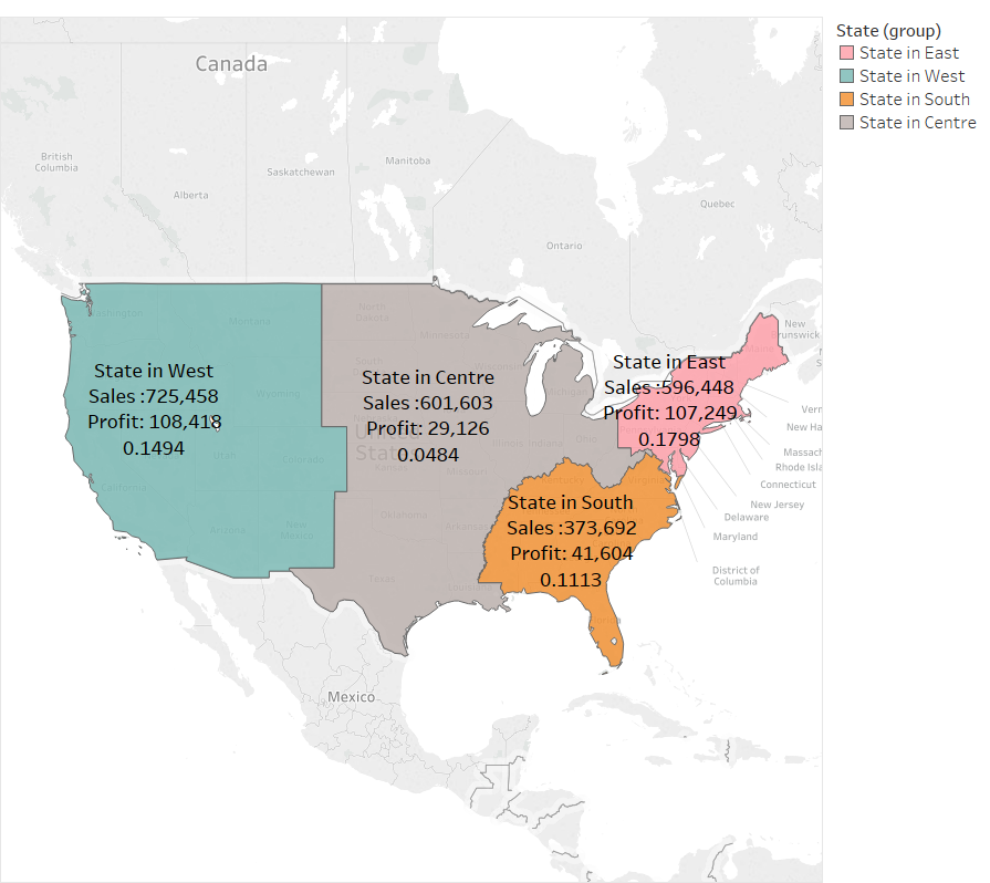
Aggregated View on Map
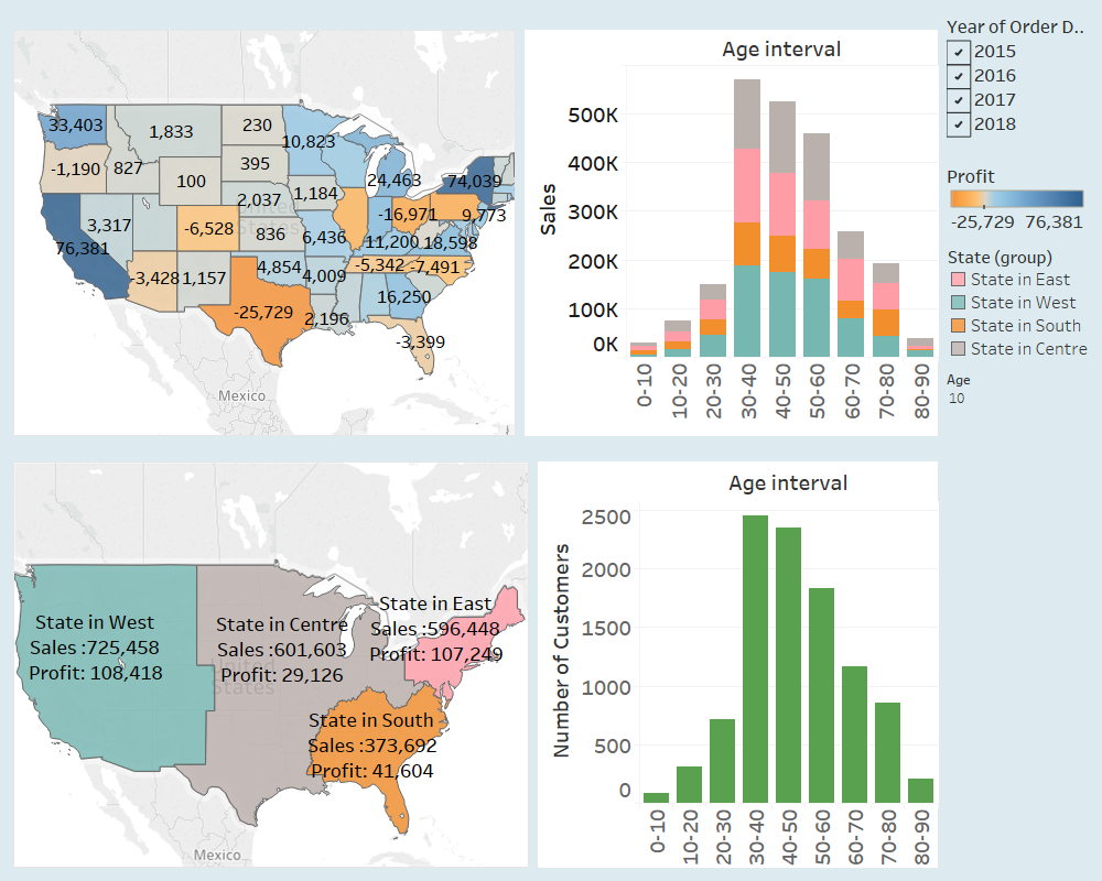
Different states are grouped together to form four groups as shown in the following graph. The data of the different states are aggregated using grouping functionality of Tableau. In the figure, different states have been manually divided into four groups as State in East, State in West, State in South and State in Centre. It has been observed that the maximum sale is in State in West while maximum profit and maximum profit margin is in State in East.
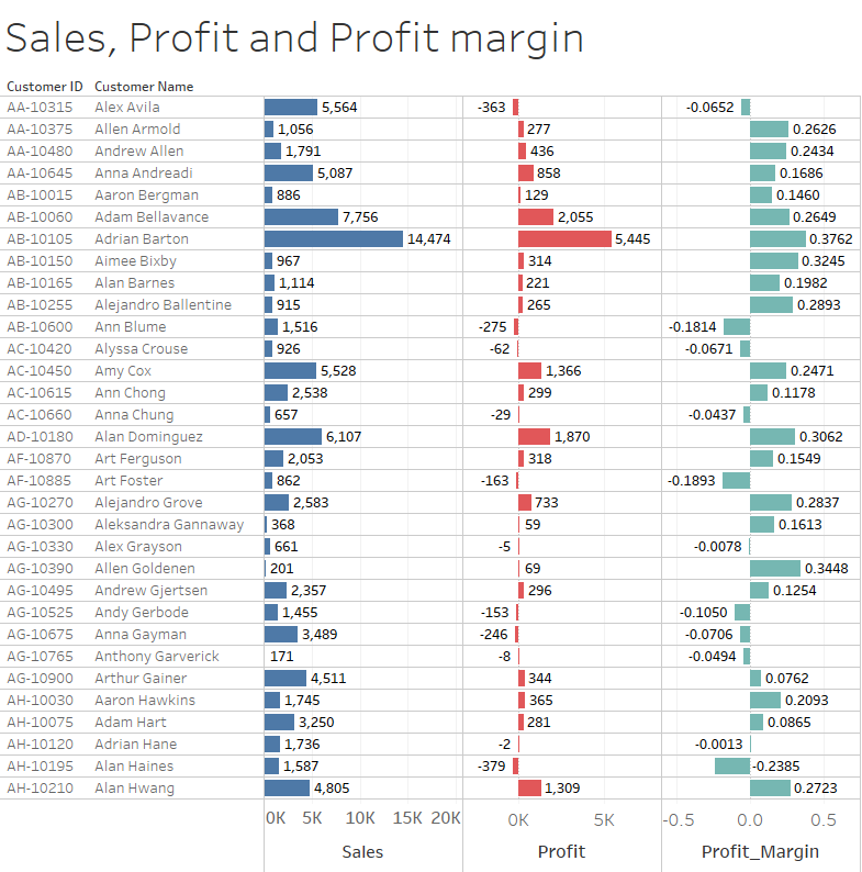
Data and Chart in a Tabular form
In the following diagram, multiple parameters of each customer namely Sales, Profit and Profit margin are shown. When we have to refer multiple attributes to make a decision, representation of data and charts in one place in a tabular form is suitable. Here, we can refer, the name of the customer their corresponding sales, profit and profit margin at a glance.
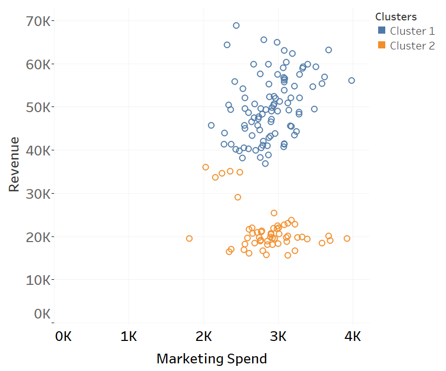
Clustering
Tableau provides built-in support for the clustering of the data point. In the following graph, data is cluster based on Revenue and Marketing spending. It can be observed that cluster 1 is a group of profitable customers. The same spending on marketing produces more than double in revenue for the customers in clusters 1. Hence, for the next campaign, we should target the customers in cluster 1. In Tableau, we can get such valueable insights easily.
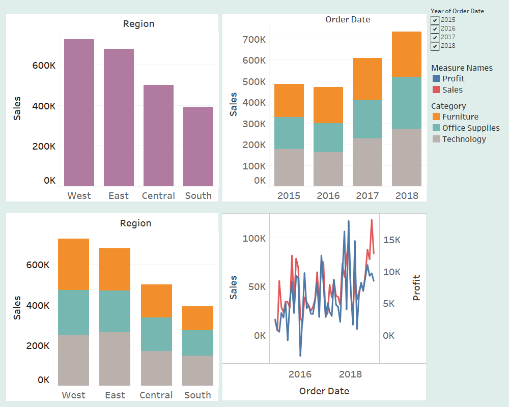
Unified view using Dashboards
The dashboard is one of the most powerful features to share multiple visualizations in one page. When we need to refer multiple graphs to understand the underlying data then dashboad is a useful tool.
In the following dashboard, multiple graphs are presented in one page where at a glance we can analyze sales in the different region, sales of the different categories on different years, sales of different categories in different regions and profit and sales in last four years.
In the following dashboard also multiple graphs are presented in one page where we can analyze sales in each state, sales of the different group of state, sales of different categories at different age & number of customers in different age range.